

Role
UX Designer
Responsible for ideation, prototyping, design iteration, and developer collaboration.
Team
- UX Researcher
- Software Engineers
- Project Owner
- 8 Pension Advisers (stakeholders/users)
TL;DR – Snapshot
Problem:
Advisers were frustrated by too many clicks and ‘hidden’ calculator buttons.
Solutions:
- Introduced a persistent submenu for quick access to calculators.
- Allowed the last-used product tab to remain open by default.
Outcome:
Advisers reported saving significant time and mental effort during large, repetitive policy input tasks.
The Problem
The recently redesigned homepage introduced a product tab layout based on user analytics. However, several Pension Advisers voiced frustrations:
- Navigation felt slower and less intuitive.
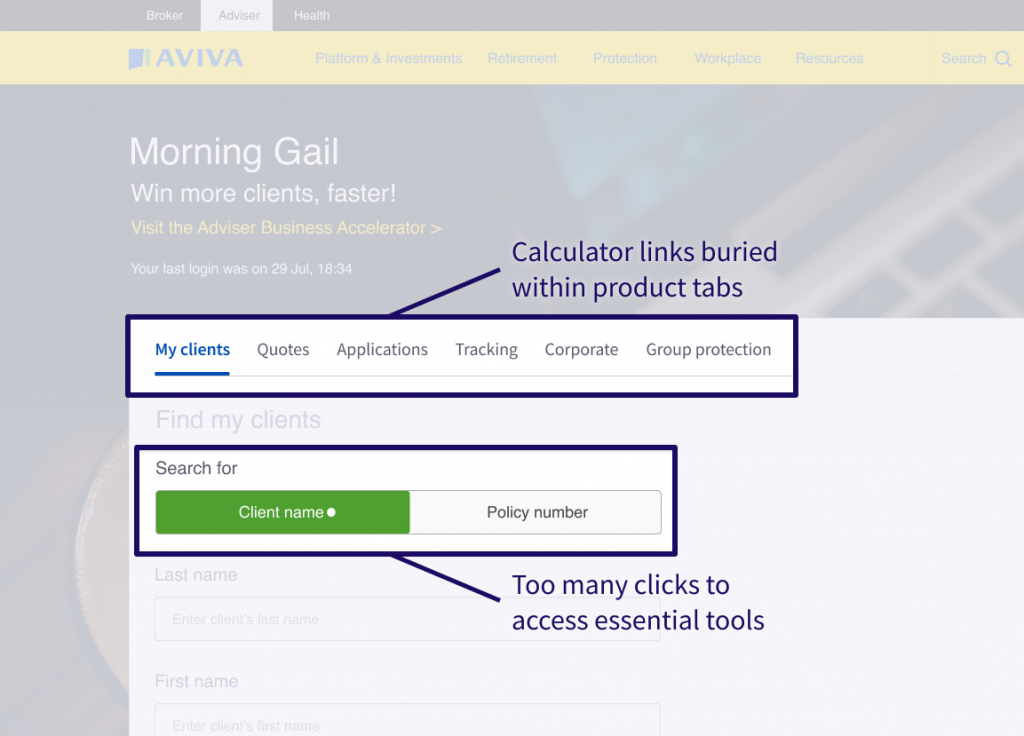
- Frequently used calculator links were buried inside product tabs.
- The interface felt more complex and ‘click-heavy’ than the previous version.
Adviser Pain Points:
- Too many clicks to access essential tools.
- Difficulty locating calculator links buried within product tabs.
- Lack of personalisation – tabs didn’t reflect their specific usage patterns.
Task
Find lightweight, effective UX solutions that improved usability without overhauling the new homepage.
Constraints:
- Minimal engineering effort (1 sprint max).
- No major layout or front-end code changes.
Research
The UX Researcher conducted user testing with:
- 6 long-term users of the old system.
- 2 newer users unfamiliar with the old design.
I observed the sessions as Advisers gave feedback while walking through the new layout.
Key Insights:
- Advisers didn’t always want the default product tab; preferences varied by task.
- Locating calculator links added friction – especially during large batch tasks.
- Users desired a personalized or remembered tab experience.
- Some missed the old ‘big list of everything’ approach.
UX Strategy & Ideation
After reviewing findings with the Product Owner and UX Researcher, we agreed to focus on incremental improvements. I explored several solutions:
Idea 1: Smart Default Tab (Data-Driven)
Auto-select the most-used product tab based on each Adviser’s historical use.
- No UI changes required; persistent personalisation.
- Would need backend changes and cross-team coordination – too costly for scope.
Idea 2: Session-Based Default Tab Selector
Let Advisers pick their default tab per session via UI controls.
- User control without database involvement.
- Could be built quickly using cookies and JavaScript.
- Required some onboarding to explain new functionality.
Idea 3: Persist Last Used Tab
Have the interface remember and reopen the last-used product tab.
- Zero learning curve; fast implementation.
- Especially useful for repetitive tasks.
- Chosen Solution for Tab Behaviour
Idea 4: Persistent Quick Links Menu
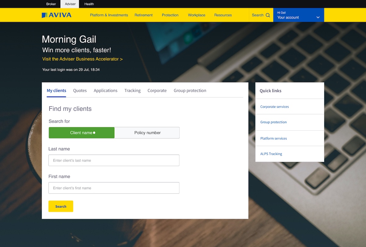
Move calculator links from hidden tab positions to a visible submenu.
- Direct access to high-use tools.
- Required UI changes and full sign-off from stakeholders.
- Chosen Solution for Calculator Access
Wireframing & Design
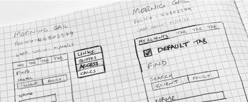
- Sketched layout options by hand to visualize submenu placement and default tab selectors.
- Created quick high-fidelity mockups in Figma, testing layout impacts from new menu placement.
- Ensured existing page structure and hierarchy remained intact.
Prototyping & Feedback
- Developed a working HTML prototype on a separate local branch to save engineering time.
- Demonstrated to Product Owner and select Advisers from the research group.
User Response:
‘This will save my sanity!‘ – Feedback from a Pension Adviser.
The feedback was overwhelmingly positive. Advisers appreciated:
- Fewer clicks per policy.
- Less cognitive friction during repetitive tasks.
- Better alignment with their daily workflows.
Outcome & Impact
Implemented a dual-solution:
- Last-used product tab persisted across sessions.
- Quick access menu added for high-priority tools (calculators).
Tangible Results:
- Reduced clicks for frequent tasks by 1 per policy input.
- For bulk input sessions (e.g., 400 policies), saved hundreds of interactions.
- Increased satisfaction and reduced complaints from key user group.
Reflection
This case exemplified how small UX changes can produce meaningful gains for users. While I initially disliked the extra visual weight of the new menu, user feedback proved its value.
‘Too many clicks’ was their key complaint. I solved it with simple, targeted UX thinking.
Key Learnings:
- Analytics alone can’t replace real user insight.
- Fast, low-code prototypes can quickly validate high-impact ideas.
- Even marginal improvements are powerful when scaled across high-volume tasks.