Role
UX Designer
Creating scalable, accessible journeys for Aviva and partner brands.
Collaborators
Software Engineers, Product Owners from Aviva, Quote Me Happy, TSB, General Accident and Barclays.
TL;DR – Snapshot
Problem:
- Outdated, inconsistent policy-management journeys across five white-label insurance brands (Aviva, Quote Me Happy, TSB, General Accident and Barclays).
- Poor accessibility (especially colour contrast and interaction design).
- Hidden tabs and cluttered interaction patterns causing confusion and extra effort.
Solutions:
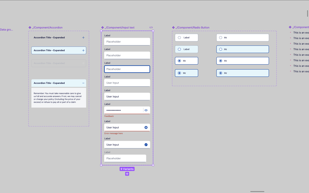
- Used Aviva’s ION design system as the base to create a unified, modular framework.
- Audited and streamlined user flows across all brands.
- Fixed accessibility failures (colour contrast, touch targets).
- Removed hidden tabs to improve discoverability.
- Established clear button hierarchy and differentiated notifications.
- Adapted layouts to each brand’s visual identity without sacrificing usability
Outcome:
- Scalable, accessible and future-proofed journey deployed across all five brands.
- Improved usability and reduced cognitive friction for customers.
- Simplified ongoing updates while maintaining brand individuality.
Project Context
This project focused on modernising and standardising the user journey across multiple white-label insurance brands – including Aviva, Quote Me Happy, TSB, General Accident, and Barclays.
Aviva was chosen as the template brand, providing both the ION design system and development framework. This allowed us to create a scalable foundation that could flex to accommodate other brands’ visual identities, while remaining technically consistent, accessible, and user-friendly.
The new journey needed to support:
- Quotes
- Policy documents
- Renewal notices
- Statements
- Multi-policy displays (home, car, van)
Goals
- Modernise outdated codebase using a new framework
- Improve accessibility (particularly colour contrast and interaction design)
- Deliver a coherent, user-friendly journey across brands
- Reduce effort for future updates
- Apply consistent UX standards while respecting brand individuality
Discovery & Research
We started with a light discovery phase – not a full redesign, but a significant UX upgrade.
Activities included:
- Journey Mapping: Mapped current user flows across all brands to identify shared patterns and pain points.
- Stakeholder Interviews: Spoke with representatives from each brand to gather style guides, brand rules, and design constraints.
- Accessibility Audits: Used AXE and WAVE to identify compliance issues, supplemented by manual testing in Figma (e.g., colour contrast).
- UX Benchmarking: Compared old and new journeys for clarity, consistency, and cognitive load.
Key findings:
- Accessibility scores were poor, especially around colour contrast and interactive elements.
- Tabbed interfaces hid important information.
- Link/button clusters were chaotic and hard to navigate.
- Brands lacked clear visual hierarchies or consistent feedback mechanisms (e.g., alerts, warnings).
Design Principles & Decisions
1. Colour Contrast (WCAG 2.1 Compliance)
- One brand’s colour palette failed accessibility tests outright. For example, two frequently paired brand colours didn’t meet contrast ratio minimums.
- Fix: We adjusted tones slightly – using a darker shade of the dark colour and a lighter version of the light one when used together. This retained brand integrity while ensuring readability.
UX Principle: Perceivability – ensuring users can see and understand content clearly, especially those with visual impairments.
2. Tabbed Policies Removed
- User testing from a previous insurance project revealed confusion around tabs. Users didn’t realise multiple policies existed because tabs hid them visually.
- Fix: We abandoned the tabs. All policies are now shown in a single scrollable view – improving discoverability and reducing cognitive friction.
UX Principle: Recognition over recall – avoid hiding content and forcing users to remember what’s hidden.
3. Cluttered Button Layouts
- Buttons and links were crammed together, with inconsistent spacing and tiny hit areas – leading to frequent miss-clicks.
- Fix: Introduced padding and logical groupings.
- Fix: Increased touch targets to comply with mobile UX best practices.
- Fix: Used spatial layout, font weight, and underlining to establish visual hierarchy.
UX Principle: Fitts’s Law – make interactive elements large and well-spaced for easier access, especially on touch devices.
4. Button and Link Hierarchy
- Required UI changes and full sign-off from stakeholders.
- Fix: Established a hierarchy using primary/secondary/tertiary styling.
- Fix: Based decisions on the expected user journey and analytics insights.
- Fix: Used the ION design system’s patterns for visual consistency.
UX Principle: Visual hierarchy – guide users’ attention by styling primary actions prominently and downplaying secondary options.
5. Notifications with No Differentiation
- Brands were using the same style for all types of messages – from simple info to serious errors.
- Introduced: Colour-coded messaging (e.g. red for error, green for success)
- Introduced: Icons to support message type
- Introduced: Clearer headings and spacing to separate notifications from core content
UX Principle: Feedback – the system should always keep users informed, using visual cues to convey the tone and importance of each message.
Design Process
Wireframing & Ideation
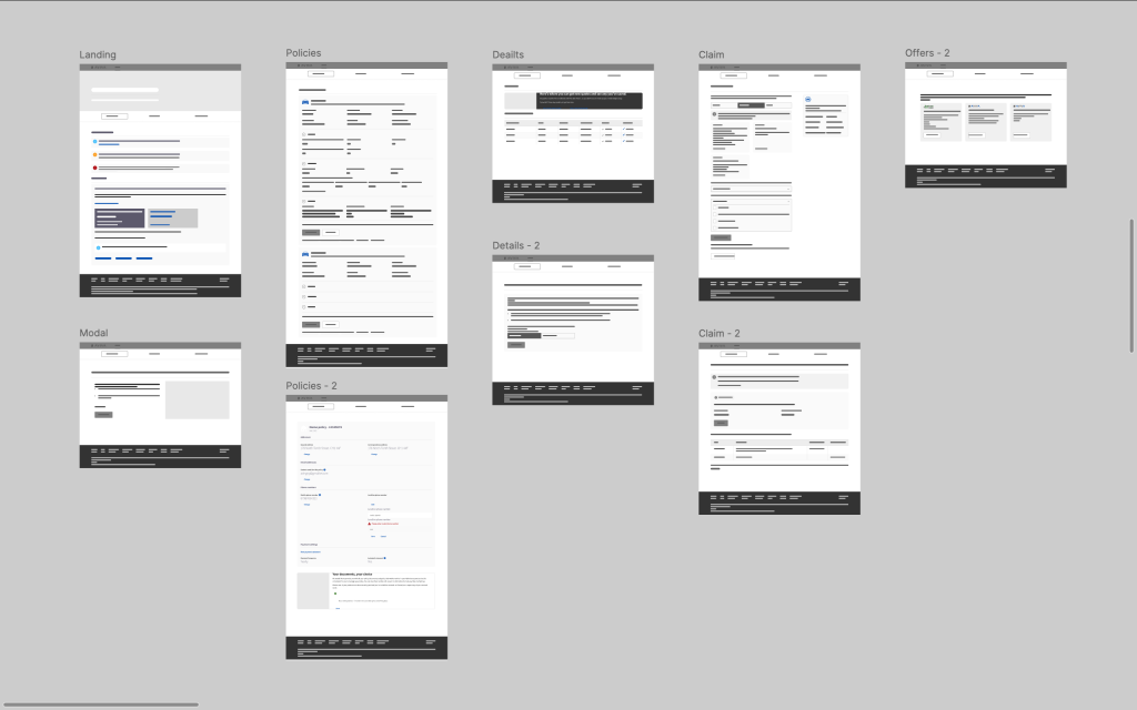
- Created base wireframes using Aviva’s layout as a foundation.
- Started with global elements: header, footer, navigation – ensuring consistency across all brands.
- Collaborated with brand teams to update link naming, destination logic, and brand-specific styling.
- Annotated wireframes with reasoning for each UX decision, referencing established design heuristics.
Hi-Fidelity Designs
- Built high-fidelity designs in Figma for Aviva first (as the base brand).
- Shared walkthroughs with the Aviva PO, iterating based on feedback.
- Extended the base layout to other brands, modifying colours, logos, and minor UI treatments per brand guidelines – without sacrificing usability.
Testing & Validation
Throughout the design and development process, we conducted:
- Accessibility checks using automated tools and manual methods.
- Design walkthroughs with stakeholders.
- Design QA to ensure spacing, interactions, and colours were implemented correctly.
Outcomes
While this wasn’t a full transformation, we delivered:
- A more modern, responsive, and maintainable codebase.
- Improved accessibility across all sites.
- Cleaner, more usable journeys for managing insurance policies.
- A modular, scalable design approach that future-proofs brand updates.
Reflections
This project highlighted the complexity of designing for white-label ecosystems: you’re solving one problem multiple ways. Striking a balance between consistency and customisation was a recurring theme.
We applied universal UX principles – accessibility, hierarchy, discoverability – and then tweaked the execution based on brand personality.
Sometimes making a colour just slightly darker can save both your WCAG score and your sanity.